December 09, 2011
Display - Relection
If I were to do this project again, I would look at other ways of presenting thoughts, perhaps by using the work of other artists as inpiration. I would also experiment more with methods of mark making, perhaps on walls or on booklet-type structures that actually unfold themselves. In the future I will set aside more time for this type of experimentation and try to not be hesitant in trying out new ideas and ways of working.
Display - Critical Appraisal
For this project I made a mind map of my thoughts and ideas for my Image project from the Field Guide. I displayed my mind map in the way in which I think of ideas in my head, which I had to consider as it may be difficult for the viewer to understand the way that I think. I didn't not want to over-complicate the map with overlapping arrows and and unclear path of thought. I think that the end result is quite effective in showing my thoughts in a way that other people can understand whilst also relating it to my Image project by altering the typography. The work is intended to be viewed in a gallery space, to make people take more time to go over the way in which they think and how a small starting point can grow into many possible outcomes.
Display - Final result

Display - ideas
As I am making a mind map based on my thoughts to do with a project on typography, I have decided to change the font and format of the writing throughout the map where fitting. Originally, I made a very basic mind map that was purely hand written, but it didn't seemed to be interesting enough for my own liking. I then decided to reconstruct the map, changing fonts, colours, sizing and methods of writing text.
 In this section of the map, I found the font used for the Field Guide (Gills Sans MT) to reproduce sections of it. I then only used my own hand writing as it represents the beginning of my thoughts, which are very personal to me.

For this section of the map, I began to change the style of writing more to fit the subject of the text.
 In this final section of the map, I used only computer typed fonts as my ideas became more finalised and I also chose to carry out my final idea for the project on a computer.


For this section of the map, I began to change the style of writing more to fit the subject of the text.

Mark Lombardi
Mark Lombardi is an artist who draws out what appear to be celestial maps, but instead are detailed documentation of major political and finacial frauds and scandals.


I have drawn from these works to make a type of mind map that show my thoughts and ideas that were brought on by my Image project from the field guide.


I have drawn from these works to make a type of mind map that show my thoughts and ideas that were brought on by my Image project from the field guide.
DISPLAY
In the Field Guide, from the Display subheading, I chose the following starting point:
"Make or design something which unfolds, opens out, or spreads out."
For this project I decided to focus on thoughts and how they unfold from one starting point and progress into personal ideas by changing routes and dismissing ideas.
Context - Reflection
If I did do this project again, I would have experimented with a wider range of tapes to see which ones gave the best effect. I ended up using reinforced silver tape as it is economical and doesn't mark walls. However I would have liked to try hazard tape as this is typically seen with restricted objects and areas. Unfortnately I did not have the money to buy so many different types of tape, especially as quite a few rolls would have been needed for each. In the future I will take more time to look around for the most suitable material for the project and also the best priced. I found this difficult to do for this project as I had an extremely limited budget and also don't have a very good knowledge of places to go within the city having only lived here for a couple of months.
Context - Critical Appraisal
For this project I used tape to outline objects around my flat to highlight them against other objects and see whether this made my flatmates more warey of using the objects. I was unsure of what tape to use. I originally started by using masking tape as it is cheap and doesn't mark walls. Unfortunately the masking tape was the exact same colour as the walls in my flat, making it almost impossible to see it in photographs. I tried to get around this problem byt drawing a solid red line down the tape.


I found that the red line wasn't quite effective to stand out as clearly as I wanted against the blank wall, so I chose to use thicker, silver reinforced tape.

I found that this tape gave a much clearer, more crisp and bold effect. As for my flatmates' reactions, they seemed confused as to why the objects were highlighted and originally thought that the people who run the accomodation which we stay in had taped around it for some reason. When I informed them of my project, their interpretations changed and instead said that it seemed as if the object had a place and couldn't be moved from that place. This supported my original intent to see whether I could control they way people interact with objects and places, just by using tape. From the photographs I took of objects that I taped around, I made a video (which can be found in my 'Context - Final result' post). I intend for the video to be played on a loop as a projection in a gallery space, perhaps just in a corner, not drawing too much attention to itself, just as a reminder of the 'red tape' society in which we all live in.
I would have liked to have taken this project onto the street and into public places to see the reaction of the public towards these ideas. However I did not have time to carry this out, and also it poses a problem with getting permission and also with weather conditions. At the moment it is damp quite often, which affects the adhesiveness of the tape, and also because of the time of year, there is a limited amount of daylight in which to carry the ideas out.
Context - Final result
This is the video that I have made using photographs of objects that I taped around in my flat.
NOTE: This video is intended to be played on a loop as a projection. However I couldn't figure out how to loop the video and still put it on the blog.
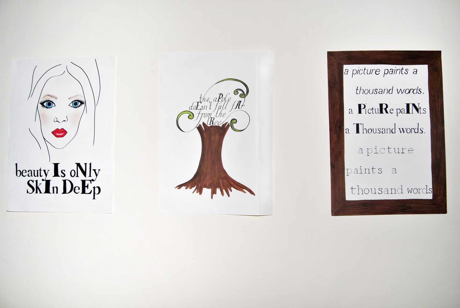
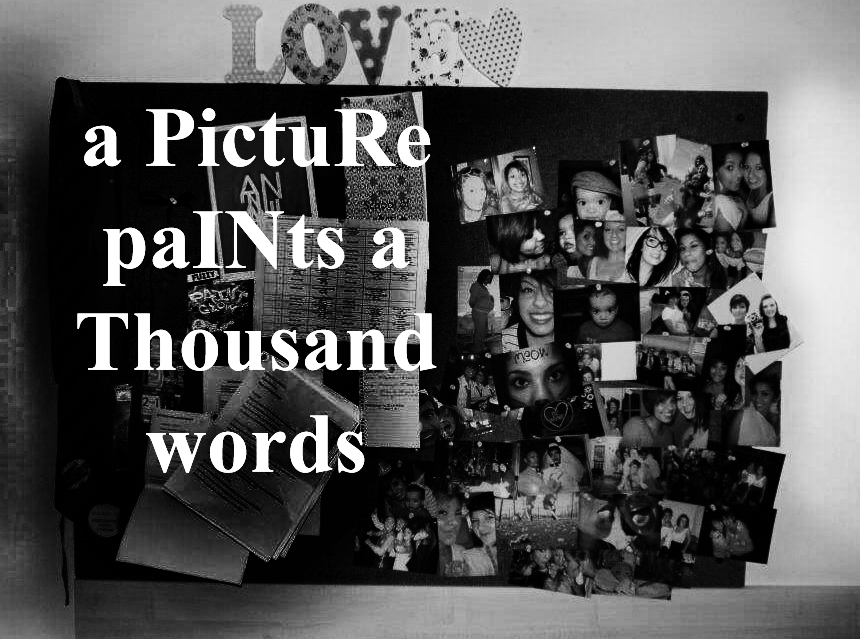
Image - Final results


December 08, 2011
Image - Reflection
For this project, I created a small series of images with the intent of getting the viewer to see a meaning in the typography that wouldn't be obvious at a first glance. I began by making 3 hand drawn illustrations that took famous quotes and by making letters stand out, spelled another word within the sentence. In the group tutorials, these received mixed responses. Some thought that they were effective, whilst some found them too messy and not drawn with enough confidence and thought that using a computer would be more effective. My original intent was to not have them too neat to show how meticulous it is to draw out computer generated fonts. Before the tutorial, I thought that the images worked well but afterwards I wasn't sure if my intent would be understood so I then decided to use a computer.
I think that the end results that I have created are as effective as the original hand drawn illustrations but seem to lack a sense of personality or creativity. I could definitely have done more research into other artists who use typography to support my work, but as it is such a vast subject I found it hard to find where to start and how to adapt to being as free thinking as the course allows, which I haven't been able to do previously. I would have liked to have had the confidence to explore differents more and which ones worked well and were appropriate for the quotes used. However I did spend a lot of time planning and carrying out the hand drawn illustrations which I unfortunately didn't end up using. If I were to do this project again, I would manage my time better, whilst also experimenting with different processes, perhaps which I had found in my research.
I think that the end results that I have created are as effective as the original hand drawn illustrations but seem to lack a sense of personality or creativity. I could definitely have done more research into other artists who use typography to support my work, but as it is such a vast subject I found it hard to find where to start and how to adapt to being as free thinking as the course allows, which I haven't been able to do previously. I would have liked to have had the confidence to explore differents more and which ones worked well and were appropriate for the quotes used. However I did spend a lot of time planning and carrying out the hand drawn illustrations which I unfortunately didn't end up using. If I were to do this project again, I would manage my time better, whilst also experimenting with different processes, perhaps which I had found in my research.
Image - Critical Appraisal
For this project, I had to consider mainly the legibility and suitability of the fonts used. Personally, I do not like fonts to be too scripted or calligraphic as I find it makes the viewer less likely to spend their time looking at the work if it is too much effort just to read what it says. I decided in the end to use simple fonts that appear to be typed or printed in order to get around this problem.
I was also conflicted as to whether to hand draw the illustrations I made or whether to process them on a computer. I tried hand drawing them, but some thought that they seemed messy. I didn't intend for them to look perfect because I wanted to convey the meticulousness of of drawing out computer fonts. However I decided to move on from this idea and computer process them instead. As I was becoming pushed for time, using a computer was also more suitable for creating images faster.
Making the letters which I needed to stand out also proved a challenge as changing the colour of the text seemed too much of an obvious change to the lettering, where as just making the letters bold and making them larger sometimes seemed to not be a big enough change for some viewers and they simply viewed the sentence as it was intended to be read. Even with this problem, I decided to use this way of making letters stand out so that the viewer may spend more time looking at the work, trying to figure out its meaning, rather than seeing it straight away and moving on.
My work is intended to be viewed as a series, simply in a gallery setting. However this style could also be transferred to other contexts such as on billboards, magazines or flashes in videos for advertising purposes.
December 06, 2011
Image - experiments
I began by making a small series of hand drawn illustrations, however they seemed to lack confidence and
were a bit messy.


Subscribe to:
Comments (Atom)