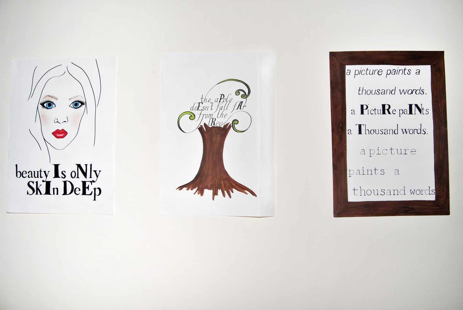
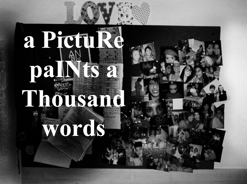
These are the final images that I made, in the order that they are intended to be viewed.
Showing posts with label image. Show all posts
December 09, 2011
December 08, 2011
Image - Reflection
For this project, I created a small series of images with the intent of getting the viewer to see a meaning in the typography that wouldn't be obvious at a first glance. I began by making 3 hand drawn illustrations that took famous quotes and by making letters stand out, spelled another word within the sentence. In the group tutorials, these received mixed responses. Some thought that they were effective, whilst some found them too messy and not drawn with enough confidence and thought that using a computer would be more effective. My original intent was to not have them too neat to show how meticulous it is to draw out computer generated fonts. Before the tutorial, I thought that the images worked well but afterwards I wasn't sure if my intent would be understood so I then decided to use a computer.
I think that the end results that I have created are as effective as the original hand drawn illustrations but seem to lack a sense of personality or creativity. I could definitely have done more research into other artists who use typography to support my work, but as it is such a vast subject I found it hard to find where to start and how to adapt to being as free thinking as the course allows, which I haven't been able to do previously. I would have liked to have had the confidence to explore differents more and which ones worked well and were appropriate for the quotes used. However I did spend a lot of time planning and carrying out the hand drawn illustrations which I unfortunately didn't end up using. If I were to do this project again, I would manage my time better, whilst also experimenting with different processes, perhaps which I had found in my research.
Labels:
image
Image - Critical Appraisal
For this project, I had to consider mainly the legibility and suitability of the fonts used. Personally, I do not like fonts to be too scripted or calligraphic as I find it makes the viewer less likely to spend their time looking at the work if it is too much effort just to read what it says. I decided in the end to use simple fonts that appear to be typed or printed in order to get around this problem.
I was also conflicted as to whether to hand draw the illustrations I made or whether to process them on a computer. I tried hand drawing them, but some thought that they seemed messy. I didn't intend for them to look perfect because I wanted to convey the meticulousness of of drawing out computer fonts. However I decided to move on from this idea and computer process them instead. As I was becoming pushed for time, using a computer was also more suitable for creating images faster.
Making the letters which I needed to stand out also proved a challenge as changing the colour of the text seemed too much of an obvious change to the lettering, where as just making the letters bold and making them larger sometimes seemed to not be a big enough change for some viewers and they simply viewed the sentence as it was intended to be read. Even with this problem, I decided to use this way of making letters stand out so that the viewer may spend more time looking at the work, trying to figure out its meaning, rather than seeing it straight away and moving on.
My work is intended to be viewed as a series, simply in a gallery setting. However this style could also be transferred to other contexts such as on billboards, magazines or flashes in videos for advertising purposes.
I was also conflicted as to whether to hand draw the illustrations I made or whether to process them on a computer. I tried hand drawing them, but some thought that they seemed messy. I didn't intend for them to look perfect because I wanted to convey the meticulousness of of drawing out computer fonts. However I decided to move on from this idea and computer process them instead. As I was becoming pushed for time, using a computer was also more suitable for creating images faster.
Making the letters which I needed to stand out also proved a challenge as changing the colour of the text seemed too much of an obvious change to the lettering, where as just making the letters bold and making them larger sometimes seemed to not be a big enough change for some viewers and they simply viewed the sentence as it was intended to be read. Even with this problem, I decided to use this way of making letters stand out so that the viewer may spend more time looking at the work, trying to figure out its meaning, rather than seeing it straight away and moving on.
My work is intended to be viewed as a series, simply in a gallery setting. However this style could also be transferred to other contexts such as on billboards, magazines or flashes in videos for advertising purposes.
Labels:
image
December 06, 2011
Image - experiments
I began by making a small series of hand drawn illustrations, however they seemed to lack confidence and
were a bit messy.
I then reproduced two of the illustrations using Photoshop and also created some other images using photographs to test how they might look.
Labels:
image
November 07, 2011
Bruce Nauman
Bruce Nauman is known for this work in neon. He often uses well known phrases or words that contradict each other in his pieces. This can particularly be seen in One Hundred Live and Die.
One Hundred Live and Die
Having Fun/Good Life
The True Artist Helps the World by Revealing Mystic Truths
Labels:
Artist research,
field guide,
image
November 05, 2011
IMAGE
One section of the Field Guide is Image, from this section I chose:
"'There is no better proof of the elegance of a typeface than obfuscating its content' prove this statement in an appropriate manner."
For this project I have decided to look at different famous and well-known phrases and change the typeface to see if it changes how the viewer perceives it.
Labels:
field guide,
image
Subscribe to:
Posts (Atom)