February 15, 2012
"Wish You Were Here!" - Reflection
If I were to do this project again I would possibly look at making the final outcome more of a traditional time capsule and try to preserve the culture of today in some way. This could lead to different paths of looking at corruption and negativity in the world, rather than focusing on positive events and places. Also I would try to put more information about myself in the box, in case someone other than me found it so that they could learn about me and how my life currently is.

'Wish You Were Here!" - Critical Appraisal
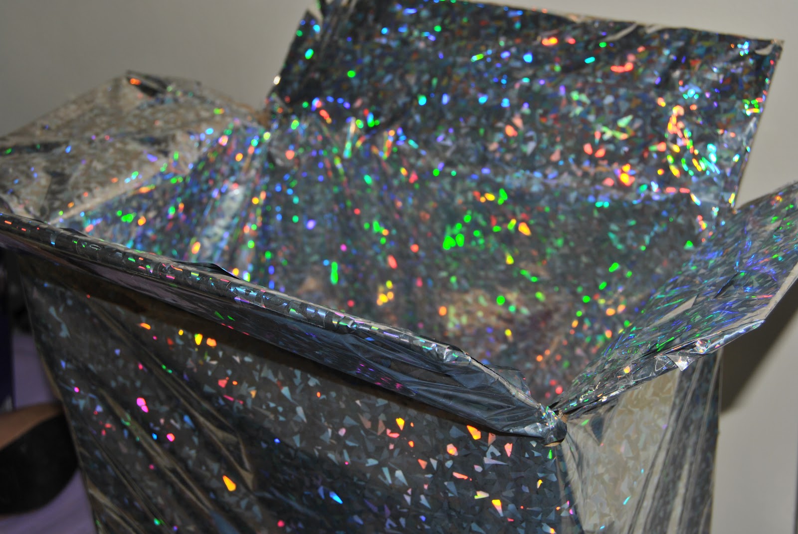
For the "Wish You Were Here!" project I decided to create a scenario where there is a theoretical apocalypse that leaves the earth with no human inhabitants besides me. I thought about how isolation would affect a person's willingness to survive and decided to try and create a box containing items and advice that would make me happier and fulfil my sense of love and belonging, without having anyone else there. I had to make the contents of the box able to withstand a long time without being replaced, almost as if it were a time capsule. Also I tried to keep the whole feel of the box lighthearted to keep me in high spirits. Apocalyptic art is so often dark, that I decided to make something different. In the end I decided to present the finished piece as a box covered in wrapping paper to keep in with the lighthearted nature and also to make it appear as a gift to myself, as if I were the only person left on Earth I wouldn't be receiving anymore presents. The piece is meant to be an examplar piece that could be presented in a gallery setting or perhaps marketed to make other people think of what they would miss and pack away in case of an emergency. The piece is also allowed to be touched and looked through by the viewer. Also certain items in the box are there to remind the future me of the idea of love and also of the unneccessary materialisation of our society.
Final Items
Advice Book Contents


Recorder Key Chain

This is a small sound recorder which I had recorded the sound of my nephew babbling on, unfortunately the battery has run out. I thought that it would be a convenient way of carrying around another human voice.

I left this deck of cards unopened, because I and a lot of people like the feeling of opening something that is brand new and being the first person to use it.


This fashion magazine, although now completely unimportant, could provide some entertainment. Also it could also raise questions on how important consumerism is in the current society.

I included this ring as a symbol of eternal love. Although the person you love may not still be around, love doesn't die. It is only a cheap ring. Ecomonocal value would be irrelevant if money didn't exist in a post-apocalyptic world.

Final Piece

What to put in the box
I've been asking myself what to put in this almost "time capsule" box, but I've been finding it difficult to think of things that would make any person happy so I have decided to make an examplar box of objects and advice that I think I would find useful in the event of an apocalypse resulting in my isolation. The most important thing that I could think of putting in the box is photographs of my friends and family, but after that it would be a book of advice.
I looked at some of the work by Noam Toran - Accessories for Lonely Man. His work made me think about the smaller things in life that a person can miss when it is suddenly gone.


I looked at some of the work by Noam Toran - Accessories for Lonely Man. His work made me think about the smaller things in life that a person can miss when it is suddenly gone.

Chest Hair Curler

Shared Cigarette
As well as the advice book, I thought about things that may be beneficial to mood. People often comfort eat when they are feeling low, but putting in a whole store of food wouldn't be practical so I tried to cut it down. Some foods are proven to make you happier so I searched for foods which release endorphins and found that the foods which could last a while in a box and still release a decent amount of endorphins are chocolate and nuts. using this information I decided to put my favourite chocolate bar (toffee crisp) and cashew nuts in my apocalypse time capsule.
I tried to think of activities to put in the box that would take my mind off feeling lonely or depressed. I looked into activities that can do this and came across a theory of 'Flow Activities' that can engage a person so much that it seems like no time at all has passed when in actuality hours could have passed. Activities like this can include playing games consoles, sports and knitting. Games consoles would be impractical and I don't know how to knit, so I decided to put a deck of cards in the box as it provides several solo games and countless multiplayer games, just in case there were more survivors after the apocalypse.
February 13, 2012
Film/TV Research
I began to research into the idea of how an apocalypse would affect the landscape and the human race by watching TV series and films based on an apocalypse and life afterwards.
Dead Set
Dead Set is a five part series that was made for Channel 4 based on the idea of a zombie epidemic whilst filming of the programme Big Brother is taking place, leaving the housemates and a couple of other survivors seeking refuge in the Big Brother house. From watching this programme I was struck by how a person has to change to become ruthless and possibly kill others in order to survive. As I wanted to focus on emotions for this project, this series wasn't hugely helpful because it is all set over a two day period which wouldn't give people very long to adjust to a solitary life.


28 Days Later
28 Days Later is a film that is also based on the premise of a zombie apocalypse. The survivors are in search of an army-run base that would offer them security. However at one point in the film, the male soldiers attempt to force themselves upon the only two female survivors despite one only being a young teen. This got me thinking about the lengths people would go to to get comfort, fulfil sexual urges or to repopulate the world.

I Am Legend
I Am Legend is also a film about a zombie apocalypse, however this one mainly focuses on life after the apocalypse. The main point of the film that stuck out for me was the extreme loneliness that the protagonist endures. He relies on his pet dog, old new recordings and imagining that dummies are alive to fulfil his need for social interaction. However, as none of these methods actually give him a person to converse with he finds it very difficult to cope and, after having to kill his dog, attempts to sacrifice himself to the zombies. This started to give me ideas as to the type of things that a person would truly miss if they were isolated and how it would affect them otherwise.

Dead Set
Dead Set is a five part series that was made for Channel 4 based on the idea of a zombie epidemic whilst filming of the programme Big Brother is taking place, leaving the housemates and a couple of other survivors seeking refuge in the Big Brother house. From watching this programme I was struck by how a person has to change to become ruthless and possibly kill others in order to survive. As I wanted to focus on emotions for this project, this series wasn't hugely helpful because it is all set over a two day period which wouldn't give people very long to adjust to a solitary life.


28 Days Later
28 Days Later is a film that is also based on the premise of a zombie apocalypse. The survivors are in search of an army-run base that would offer them security. However at one point in the film, the male soldiers attempt to force themselves upon the only two female survivors despite one only being a young teen. This got me thinking about the lengths people would go to to get comfort, fulfil sexual urges or to repopulate the world.

I Am Legend
I Am Legend is also a film about a zombie apocalypse, however this one mainly focuses on life after the apocalypse. The main point of the film that stuck out for me was the extreme loneliness that the protagonist endures. He relies on his pet dog, old new recordings and imagining that dummies are alive to fulfil his need for social interaction. However, as none of these methods actually give him a person to converse with he finds it very difficult to cope and, after having to kill his dog, attempts to sacrifice himself to the zombies. This started to give me ideas as to the type of things that a person would truly miss if they were isolated and how it would affect them otherwise.

February 01, 2012
Why I Chose to Focus On Loneliness
I began by thinking about the needs of every human being. Previously I learned about the studies of a man called Maslow and what he thought to be a hierarchy of needs.
 I thought that if a person was in near/total isolation, the most basic needs (physiological and safety) would become instinctive. The higher needs however would take more than instinct to put into effect. I decided to focus on the 'Love/Belonging' section, which looks at friendship, family and sexual intimacy. Obviously if there are no other people in the world, achieving any of these three aspects of life is pretty much impossible. However, I thought that if I would in some way keep the person motivated and provoke memories of times when they did feel loved and like they belong, then they would be happier.
It's known that if a person doesn't feel any sort of intimacy, this can lead to depression and anxiety. A person suffering with these can find themselves having little or no interest in activities and in the case of someone who is completely self-reliant, it could mean the difference between surviving and dying, depending on whether they have the will to survive.

It's known that if a person doesn't feel any sort of intimacy, this can lead to depression and anxiety. A person suffering with these can find themselves having little or no interest in activities and in the case of someone who is completely self-reliant, it could mean the difference between surviving and dying, depending on whether they have the will to survive.
'Wish You Were Here!" - Project Brief
The whole group was given the idea of an apocalyptic/post-apocalyptic world and told to make
artwork related to the prospect of a world that has been destroyed in some way. I decided to imagine
that a single person has been left and believe that they are the only surviving human as they have no
contact with anyone else and appear to be the only person in the surrounding area.
I am going to look at the human need for love/belonging. The basic physiological needs e.g. food,
water, breathing, can be very instinctive to fulfil. If a person is hungry, they will find food. However,
if a person is unhappy it can be difficult to get out of that way of thinking and that can affect a
person’s determination to survive. I want to compile a collection of items that have the potential to
uplift and motivate a person who is left behind by the apocalypse. I will look at which aspects of life
make us the happiest and try to capture these in a way that is portable like a ‘bag of happiness’.
By the end of this project I hope to have a collection of items and possibly activities that could be of
use to a person in the post-apocalyptic world. The items would not be for practical survival, but
instead to fulfil a higher need that can put the survivor in the mind set to carry on living and be able to
cope better with extreme isolation.
artwork related to the prospect of a world that has been destroyed in some way. I decided to imagine
that a single person has been left and believe that they are the only surviving human as they have no
contact with anyone else and appear to be the only person in the surrounding area.
I am going to look at the human need for love/belonging. The basic physiological needs e.g. food,
water, breathing, can be very instinctive to fulfil. If a person is hungry, they will find food. However,
if a person is unhappy it can be difficult to get out of that way of thinking and that can affect a
person’s determination to survive. I want to compile a collection of items that have the potential to
uplift and motivate a person who is left behind by the apocalypse. I will look at which aspects of life
make us the happiest and try to capture these in a way that is portable like a ‘bag of happiness’.
By the end of this project I hope to have a collection of items and possibly activities that could be of
use to a person in the post-apocalyptic world. The items would not be for practical survival, but
instead to fulfil a higher need that can put the survivor in the mind set to carry on living and be able to
cope better with extreme isolation.
December 09, 2011
Display - Relection
If I were to do this project again, I would look at other ways of presenting thoughts, perhaps by using the work of other artists as inpiration. I would also experiment more with methods of mark making, perhaps on walls or on booklet-type structures that actually unfold themselves. In the future I will set aside more time for this type of experimentation and try to not be hesitant in trying out new ideas and ways of working.
Display - Critical Appraisal
For this project I made a mind map of my thoughts and ideas for my Image project from the Field Guide. I displayed my mind map in the way in which I think of ideas in my head, which I had to consider as it may be difficult for the viewer to understand the way that I think. I didn't not want to over-complicate the map with overlapping arrows and and unclear path of thought. I think that the end result is quite effective in showing my thoughts in a way that other people can understand whilst also relating it to my Image project by altering the typography. The work is intended to be viewed in a gallery space, to make people take more time to go over the way in which they think and how a small starting point can grow into many possible outcomes.
Display - Final result

Display - ideas
As I am making a mind map based on my thoughts to do with a project on typography, I have decided to change the font and format of the writing throughout the map where fitting. Originally, I made a very basic mind map that was purely hand written, but it didn't seemed to be interesting enough for my own liking. I then decided to reconstruct the map, changing fonts, colours, sizing and methods of writing text.
 In this section of the map, I found the font used for the Field Guide (Gills Sans MT) to reproduce sections of it. I then only used my own hand writing as it represents the beginning of my thoughts, which are very personal to me.

For this section of the map, I began to change the style of writing more to fit the subject of the text.
 In this final section of the map, I used only computer typed fonts as my ideas became more finalised and I also chose to carry out my final idea for the project on a computer.


For this section of the map, I began to change the style of writing more to fit the subject of the text.

Mark Lombardi
Mark Lombardi is an artist who draws out what appear to be celestial maps, but instead are detailed documentation of major political and finacial frauds and scandals.


I have drawn from these works to make a type of mind map that show my thoughts and ideas that were brought on by my Image project from the field guide.


I have drawn from these works to make a type of mind map that show my thoughts and ideas that were brought on by my Image project from the field guide.
DISPLAY
In the Field Guide, from the Display subheading, I chose the following starting point:
"Make or design something which unfolds, opens out, or spreads out."
For this project I decided to focus on thoughts and how they unfold from one starting point and progress into personal ideas by changing routes and dismissing ideas.
Context - Reflection
If I did do this project again, I would have experimented with a wider range of tapes to see which ones gave the best effect. I ended up using reinforced silver tape as it is economical and doesn't mark walls. However I would have liked to try hazard tape as this is typically seen with restricted objects and areas. Unfortnately I did not have the money to buy so many different types of tape, especially as quite a few rolls would have been needed for each. In the future I will take more time to look around for the most suitable material for the project and also the best priced. I found this difficult to do for this project as I had an extremely limited budget and also don't have a very good knowledge of places to go within the city having only lived here for a couple of months.
Context - Critical Appraisal
For this project I used tape to outline objects around my flat to highlight them against other objects and see whether this made my flatmates more warey of using the objects. I was unsure of what tape to use. I originally started by using masking tape as it is cheap and doesn't mark walls. Unfortunately the masking tape was the exact same colour as the walls in my flat, making it almost impossible to see it in photographs. I tried to get around this problem byt drawing a solid red line down the tape.


I found that the red line wasn't quite effective to stand out as clearly as I wanted against the blank wall, so I chose to use thicker, silver reinforced tape.


I found that this tape gave a much clearer, more crisp and bold effect. As for my flatmates' reactions, they seemed confused as to why the objects were highlighted and originally thought that the people who run the accomodation which we stay in had taped around it for some reason. When I informed them of my project, their interpretations changed and instead said that it seemed as if the object had a place and couldn't be moved from that place. This supported my original intent to see whether I could control they way people interact with objects and places, just by using tape. From the photographs I took of objects that I taped around, I made a video (which can be found in my 'Context - Final result' post). I intend for the video to be played on a loop as a projection in a gallery space, perhaps just in a corner, not drawing too much attention to itself, just as a reminder of the 'red tape' society in which we all live in.
I would have liked to have taken this project onto the street and into public places to see the reaction of the public towards these ideas. However I did not have time to carry this out, and also it poses a problem with getting permission and also with weather conditions. At the moment it is damp quite often, which affects the adhesiveness of the tape, and also because of the time of year, there is a limited amount of daylight in which to carry the ideas out.
Context - Final result
This is the video that I have made using photographs of objects that I taped around in my flat.
NOTE: This video is intended to be played on a loop as a projection. However I couldn't figure out how to loop the video and still put it on the blog.
Image - Final results


December 08, 2011
Image - Reflection
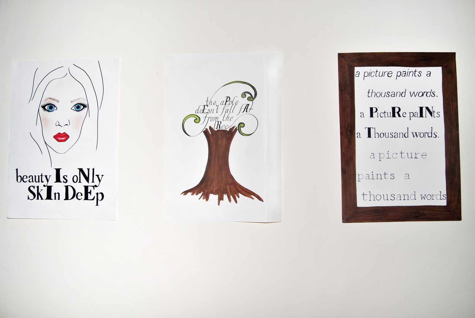
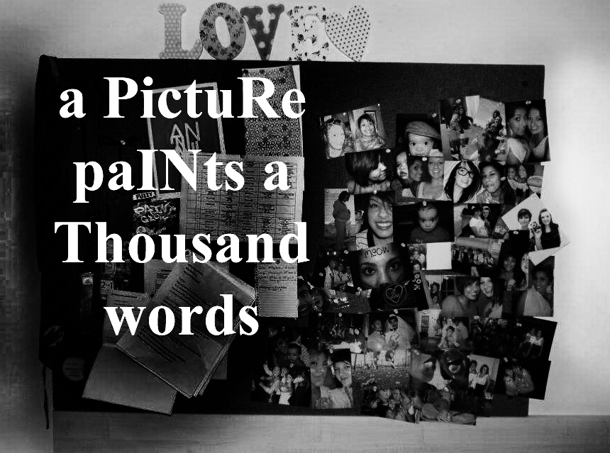
For this project, I created a small series of images with the intent of getting the viewer to see a meaning in the typography that wouldn't be obvious at a first glance. I began by making 3 hand drawn illustrations that took famous quotes and by making letters stand out, spelled another word within the sentence. In the group tutorials, these received mixed responses. Some thought that they were effective, whilst some found them too messy and not drawn with enough confidence and thought that using a computer would be more effective. My original intent was to not have them too neat to show how meticulous it is to draw out computer generated fonts. Before the tutorial, I thought that the images worked well but afterwards I wasn't sure if my intent would be understood so I then decided to use a computer.
I think that the end results that I have created are as effective as the original hand drawn illustrations but seem to lack a sense of personality or creativity. I could definitely have done more research into other artists who use typography to support my work, but as it is such a vast subject I found it hard to find where to start and how to adapt to being as free thinking as the course allows, which I haven't been able to do previously. I would have liked to have had the confidence to explore differents more and which ones worked well and were appropriate for the quotes used. However I did spend a lot of time planning and carrying out the hand drawn illustrations which I unfortunately didn't end up using. If I were to do this project again, I would manage my time better, whilst also experimenting with different processes, perhaps which I had found in my research.
I think that the end results that I have created are as effective as the original hand drawn illustrations but seem to lack a sense of personality or creativity. I could definitely have done more research into other artists who use typography to support my work, but as it is such a vast subject I found it hard to find where to start and how to adapt to being as free thinking as the course allows, which I haven't been able to do previously. I would have liked to have had the confidence to explore differents more and which ones worked well and were appropriate for the quotes used. However I did spend a lot of time planning and carrying out the hand drawn illustrations which I unfortunately didn't end up using. If I were to do this project again, I would manage my time better, whilst also experimenting with different processes, perhaps which I had found in my research.
Image - Critical Appraisal
For this project, I had to consider mainly the legibility and suitability of the fonts used. Personally, I do not like fonts to be too scripted or calligraphic as I find it makes the viewer less likely to spend their time looking at the work if it is too much effort just to read what it says. I decided in the end to use simple fonts that appear to be typed or printed in order to get around this problem.
I was also conflicted as to whether to hand draw the illustrations I made or whether to process them on a computer. I tried hand drawing them, but some thought that they seemed messy. I didn't intend for them to look perfect because I wanted to convey the meticulousness of of drawing out computer fonts. However I decided to move on from this idea and computer process them instead. As I was becoming pushed for time, using a computer was also more suitable for creating images faster.
Making the letters which I needed to stand out also proved a challenge as changing the colour of the text seemed too much of an obvious change to the lettering, where as just making the letters bold and making them larger sometimes seemed to not be a big enough change for some viewers and they simply viewed the sentence as it was intended to be read. Even with this problem, I decided to use this way of making letters stand out so that the viewer may spend more time looking at the work, trying to figure out its meaning, rather than seeing it straight away and moving on.
My work is intended to be viewed as a series, simply in a gallery setting. However this style could also be transferred to other contexts such as on billboards, magazines or flashes in videos for advertising purposes.
I was also conflicted as to whether to hand draw the illustrations I made or whether to process them on a computer. I tried hand drawing them, but some thought that they seemed messy. I didn't intend for them to look perfect because I wanted to convey the meticulousness of of drawing out computer fonts. However I decided to move on from this idea and computer process them instead. As I was becoming pushed for time, using a computer was also more suitable for creating images faster.
Making the letters which I needed to stand out also proved a challenge as changing the colour of the text seemed too much of an obvious change to the lettering, where as just making the letters bold and making them larger sometimes seemed to not be a big enough change for some viewers and they simply viewed the sentence as it was intended to be read. Even with this problem, I decided to use this way of making letters stand out so that the viewer may spend more time looking at the work, trying to figure out its meaning, rather than seeing it straight away and moving on.
My work is intended to be viewed as a series, simply in a gallery setting. However this style could also be transferred to other contexts such as on billboards, magazines or flashes in videos for advertising purposes.
December 06, 2011
Image - experiments
I began by making a small series of hand drawn illustrations, however they seemed to lack confidence and
were a bit messy.





Subscribe to:
Posts (Atom)